
Why vulnerability matters12:24
Spike Jonze’s Her has stayed with me since I first saw it in 2013. What struck me was not only its vision of artificial intelligence, but how quietly the film centred emotion over technology. A decade later, ChatGPT brought large language models into the mainstream, and Samantha no longer felt entirely fictional. That shift shaped my work on two AI products, VideoLingo and Viora. Across both, I learned that AI product design is not simply about exposing more capable technology. Before users can benefit from it, they need to know: Can I trust it with my work? What is it doing? Will it understand me?
Product strategy
Brand & visual design
UI/UX design
Front-end implementation
VideoLingo: 1 designer · 1 engineer
Viora: Team of 4
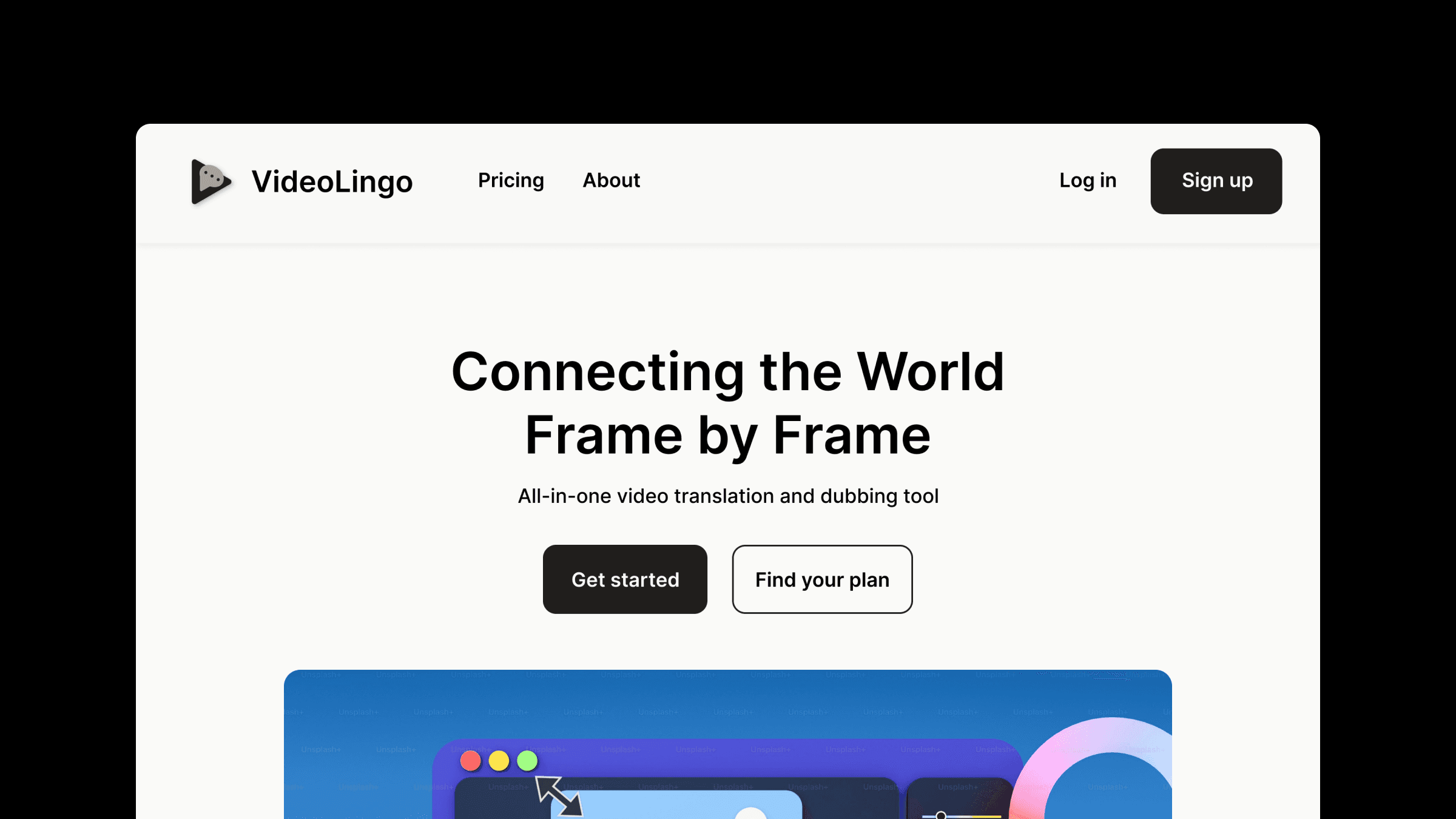
VideoLingo is an AI-powered video translation tool: paste a video link, and it generates translated subtitles and dubbed audio. It was the first AI product I worked on as a designer. I designed the brand identity, landing page, visual system, and end-to-end user experience. The AI works behind the scenes, analysing, translating, and segmenting speech without appearing in the interface. As with most AI products, users never see the model itself. They submit an input to a black box and judge it entirely by the output.
Even a strong model and technical architecture would not make the product successful if users were reluctant to submit their videos, could not tell what the system was doing, did not know how long it would take, or doubted whether the result would be usable. The key design challenge was reducing the risk users felt when committing an entire video. First, we decided to show a preview before processing the full video. The product translates a few sentences or seconds of footage first, so users can check the expected quality before continuing. Second, we made the process transparent. A step-by-step progress indicator explains what the system is doing and how much time remains. Instead of leaving users with a loading spinner, it shows the current stage and what comes next.
The previous decisions helped users get started; output quality determined whether they stayed. The hardest part of translation is making it feel natural. Every language and video brings its own details—cultural references, domain-specific terminology, verbal habits, and pronunciation patterns—and these are where general-purpose translation often falls short. We used Netflix subtitles as our quality benchmark, looking beyond literal accuracy to line breaks, tone, punctuation, and timing against the video. Most of this work happens in the back end, but the interface still needs to communicate that level of quality and reliability. Every part of the product should reassure users that the translation will feel natural and be ready to use.
Despite its small team, VideoLingo achieved strong results: #2 on GitHub Trending across all languages, 18.2k+ stars, more than 6,000 users, and over $2,800 in monthly revenue. The project led me to a new question: could AI move beyond being an invisible efficiency tool and become something people actually talk to? With Viora, that question became more specific: when AI becomes a visible participant in the interface, what makes people willing to engage with it?
Viora is a voice agent for macOS built around three elements: a floating desktop orb, agent cards, and a home screen. Users hold a keyboard shortcut and speak. Viora interprets the request, then responds by dictating into the active app, giving a short answer, or using a tool to complete a task. Unlike VideoLingo, the AI is no longer hidden behind the output. Users interact with it through an ongoing conversation, and our long-term goal is to create an experience that feels like Her. Tools such as Claude Code and Codex also changed how I worked. I could turn design ideas into working front-end experiences, build a testing environment, and revise the product directly in response to user feedback. This blurred the line between research, design, implementation, and testing. Instead of following a fixed process, I focused on the decisions themselves: what evidence supported them and whether they survived implementation. Rather than reviewing Viora step by step, I want to tell its story through four questions that kept resurfacing.
Speaking to an AI can feel more awkward than typing. People already know how to use a keyboard, so switching to voice takes effort. Talking to a computer can also feel strange when there is no obvious listener. Users may worry about choosing the wrong words, speaking for too long or too briefly, or not being understood when their thoughts are incomplete. The design therefore had to make imperfect speech feel safe.
First, users need immediate feedback. While the user speaks, the floating orb enters a listening state. An agent card then appears to confirm that the request was received and show how it is being interpreted. Viora acknowledges the request immediately instead of waiting until a complete response is ready. If a user says, “I want to get something done today,” Viora might reply, “Sure—when should I start?” This acknowledgment keeps the conversation moving and makes it easier to continue.
Second, it needs tolerance for imperfection. If users feel they must speak in complete, precise sentences, voice becomes effortful. The system should recover gracefully from imperfect input. If speech recognition mishears a term the user often uses, Viora can draw on memory and a personal dictionary to recover the intended word. If a request is rambling or poorly organised, it can distil the underlying intent. Once users realise they do not need to speak perfectly, voice feels much easier to use.
Instead of a conventional voice waveform pill, we chose a sphere inspired by Siri because it felt more alive. The blue-and-purple orb has five states. When inactive, it appears to breathe as highlights drift slowly inside it. On hover, it grows slightly and rotates toward the user. While the user speaks, particles spin faster and become more visible in response to volume and pace, confirming that Viora is receiving input. After the user releases the shortcut, the motion settles into a steady rotation to signal that Viora is processing. During voice output, colour gradients expand with the audio level. Changes in rhythm and direction allow one element to communicate every state.
This is the most motion-intensive part of the product. The rest of the interface remains deliberately quiet, without competing colours or patterns. The orb draws on the visual language of a crystal ball: an off-white base with sky blue and pale purple keeps it light and translucent while remaining restrained. It serves as the agent’s on-screen presence and anchors the brand mark.
In many AI products, voice is added to a conventional chat interface. Two patterns are common: a microphone in the corner of the input field, which treats voice as an extension of typing; or an animated waveform pill that signals recording. The first still assumes users will begin with the keyboard. The second feels more like dictation than an agent built for ongoing interaction. Both patterns work well when voice supports an existing input field, but not when voice is meant to be the primary mode.
That was not what we wanted for Viora. If users open the interface and first see a blank input field, they are likely to default to typing. Voice becomes an optional extra.
So we decided not to make the input field the product’s primary entry point. When Viora is activated, users first encounter the floating orb and an agent card. They can hold a keyboard shortcut and start speaking. The orb shows whether Viora is listening, processing, or responding, while the agent card shows how the request was understood and presents the next actions. The input field remains at the bottom of the card as a fallback, but it no longer occupies the centre of the interface. We also assigned separate shortcuts to dictation and question answering instead of using clicks inside the field to switch modes. This establishes the mental model of speaking with an agent rather than entering content into a form.
This was a deliberate trade-off: keeping the input field gives users a fallback; de-emphasising it allows voice to become the primary mode.
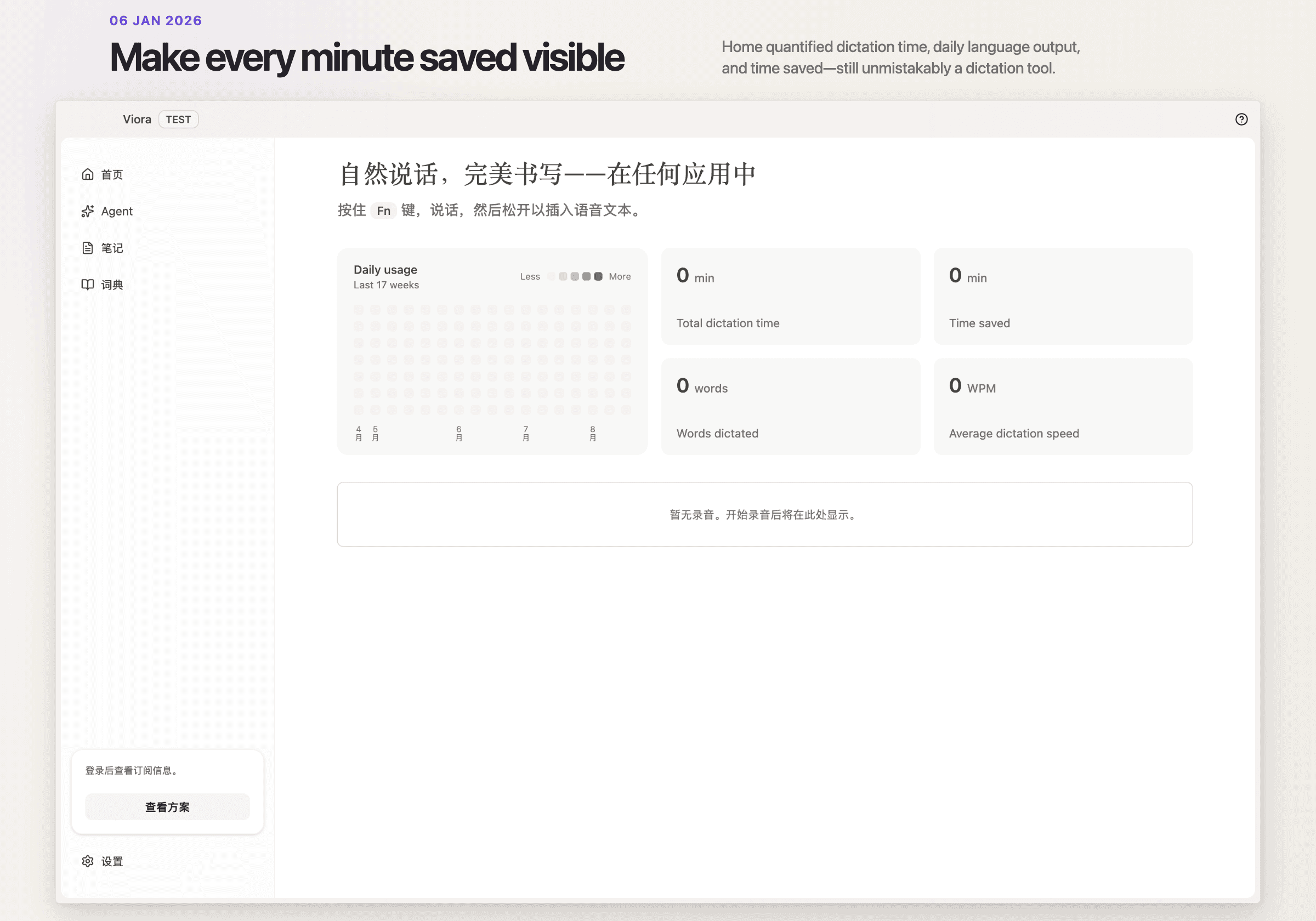
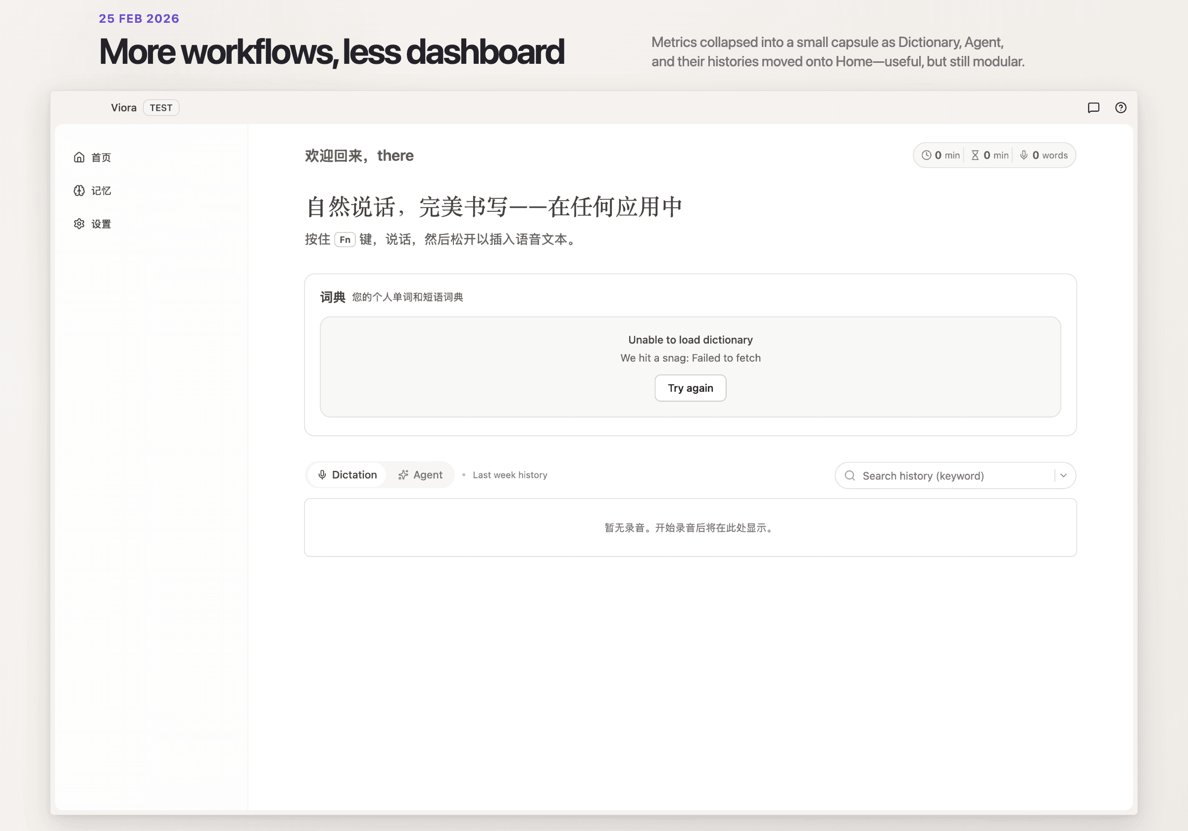
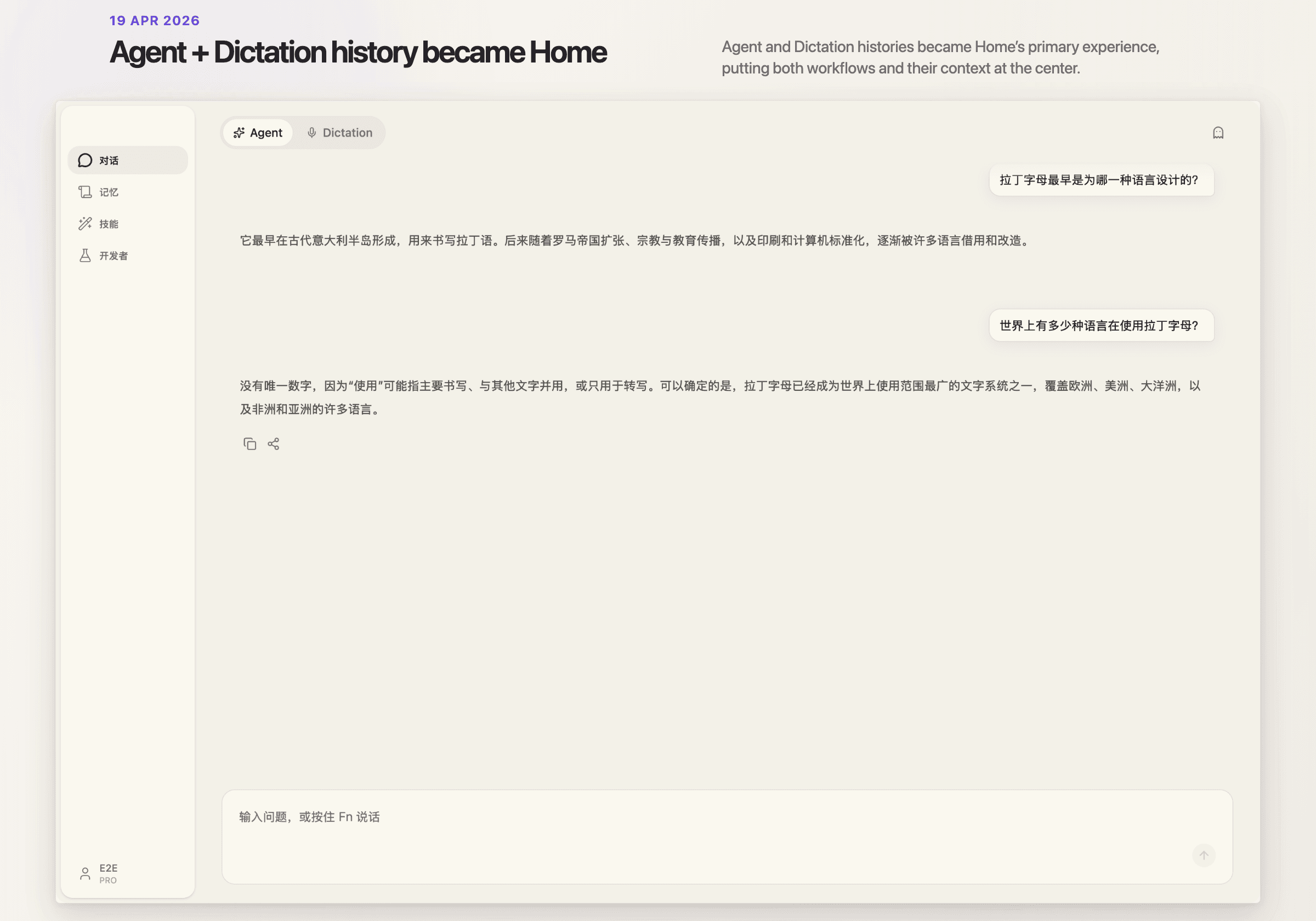
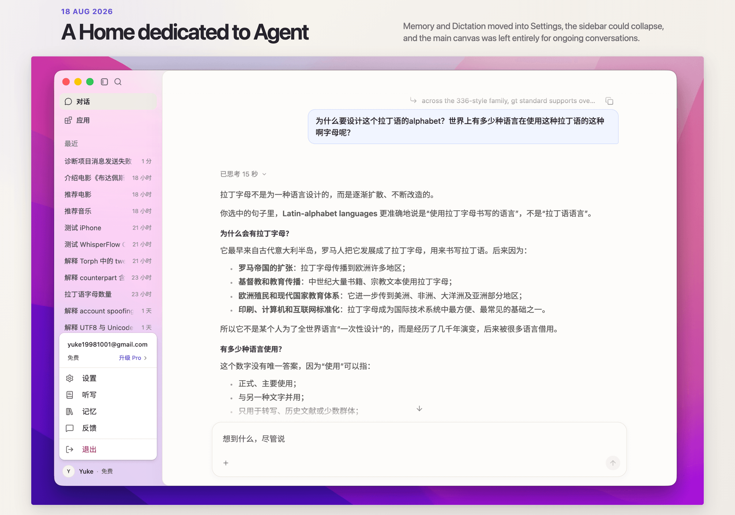
Across several rounds of user testing, one pattern became clear: the less we showed on the home screen, the faster users began interacting, and the better the experience felt. As AI products become more capable, their dashboards also become more crowded—Memory, Skills, Connectors, Artifacts, and a growing number of Apps. Each feature extends the system, but together they make the product harder to understand. I initially assumed that these settings would make Viora feel more capable and professional. Testing showed the opposite. Even a necessary feature such as Connectors caused some users to hesitate: What is this? Do I need to set it up first? Will the product work without it? Every new entry point asks users to understand more of the system before they can begin a conversation.
We moved these features deeper into the product. The home screen now focuses on the conversation between the user and Viora, with only a few essential entry points such as search and the user avatar. Advanced features remain available through search and contextual prompts, but people who simply want Viora to organise a folder or send an email do not need to see them. This simplification depended on moving complexity behind the scenes: memory, dictation, rewriting, and privacy controls all require careful logic in the back end. The interface can remain simple because the system does more of the work.
This also led me to reconsider how much onboarding should teach. Because voice is unfamiliar, designers may be tempted to explain everything before users enter the product. Our tests pointed in the opposite direction. The first experience needs to answer only one question: What can I say right now, and how should I say it? More advanced capabilities can appear when users actually need them.
We are continuing to iterate on Viora and study emerging AI interaction models, including Grok Bot. Across both products, the recurring question has been less about what AI can do than about what makes people willing to use it. In VideoLingo, AI stays behind the scenes, so the interface must make the process and output predictable. In Viora, AI becomes a visible participant. The design challenge shifts to providing immediate feedback, accommodating imperfect speech, and keeping the interface quiet enough for conversation to feel natural.
More capability does not always require more interface. As the system grows more complex, its entry point should become simpler. Together, these projects changed how I think about AI product design: advanced systems should feel understandable, trustworthy, and easy to engage with. The technology can remain complex behind the scenes; the experience should make it clear what the system is doing and invite people to respond. That may also be why Her has stayed with me. What moved me was not simply Samantha’s intelligence, but how quickly Theodore began to speak with her naturally—to hesitate, fall silent, and wait for a reply.
Source: Her — Official Trailer 1, Warner Bros.