Most café discovery tools, including Google Maps and Yelp, rank places by rating and distance. But café lovers often choose more intuitively. Beyond proximity, price, and quality, atmosphere, interior design, and whether a place simply feels right can determine where they go. Through interviews, we identified these personality-linked preferences and found that existing products did little to support them. BrewMatch reframes café discovery from “Which place is highly rated or nearby?” to “Which place fits me?”
This was a three-person student project. One teammate led front-end development, another led visual design, and I led product management and UX: competitor research, user interviews, feature definition, user flows, information architecture, content, and the final pitch.
User research
Information architecture
UI/UX design
1 × UX designer
1 × UI designer
1 × engineer

Matching by personality, not ratings
To make the experience engaging while improving match quality, we made a personality quiz the entry point. Research showed that personality-linked preferences strongly influenced café choice but were largely ignored by existing products. Personality quizzes were also familiar, popular, and easy to share. The quiz became both the matching mechanism and a reason to open the app. In prototype testing, it was the feature users remembered and valued most, showing that the premise resonated.
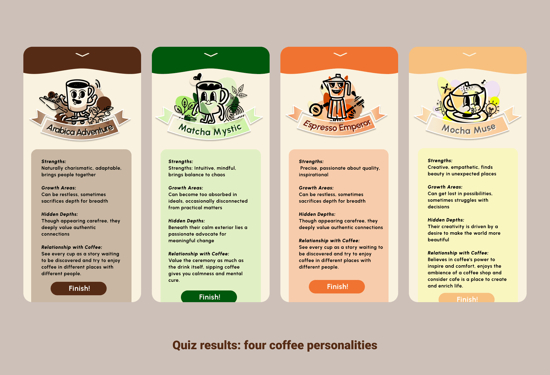
Rethinking onboarding
For a product aimed at younger users with an unfamiliar premise, onboarding was both the hardest and most critical part: how could six to eight questions translate someone’s personality into credible café recommendations without making the experience tedious?
I initially framed onboarding as a story about a secret coffee recipe, with questions embedded in the narrative and a personality reveal at the end. But the full story made onboarding too heavy: users faced a long read before entering the app. We reduced the narrative, moved to a few direct questions that capture broad personality signals, and then took users straight to the home screen. Some ambiguity remained intentional to encourage instinctive answers. We sacrificed some story and playfulness because onboarding’s first job is to move people smoothly into the product, not complete a narrative.

From one-way reviews to a two-way relationship
On Google Maps or Yelp, café profiles are largely passive: users leave reviews, while owners can reply but have few ways to shape ongoing interaction. BrewMatch makes the relationship more reciprocal by letting cafés actively manage their presence and connect with customers.
On the merchant side, cafés can publish events, update seating maps, and announce menu or interior changes, all reflected in real time in the customer app. On the customer side, users can do more than browse: they can reserve seats, buy coffee or merchandise in the app, and enter event giveaways.


Turning chance into planning
Seat booking is the key feature. Research revealed a common pain point: the more popular a café is, the harder it is to find a seat—especially on weekends, when people want to work or meet friends. We designed time-based reservations that let users book a specific seat from 1–3 p.m., view its location on the floor plan, and check for nearby power outlets. This turns uncertainty into a plan while helping cafés understand demand patterns and seating preferences.
Given the project’s time and resource constraints, we designed and prototyped only the customer experience; the merchant side remained future scope.
BrewMatch was a small project created by three girls from different backgrounds who share a love of coffee. It addressed a question I keep returning to: can familiar categories such as café discovery, food reviews, and maps still offer something new? My approach was to identify a need many people feel but rarely articulate—finding a café that fits them—and address it through one lightweight mechanism rather than adding more features to existing search apps.
