Each year, Sheridan’s Digital Product Design program partners with a professional studio on a live brief. Our team worked with design consultancy Changemaker to design a digital product that could help drivers rethink speed and control, and ultimately reduce speeding.
Most existing approaches rely on warnings or punishment, such as speed alerts and monitoring. Our research pointed in the opposite direction: warnings have limited impact and often become easier to ignore with experience. We asked what could actually change a driver’s judgment and habits.
Designed the research plan: screener, interview guide, desk research, and ethics protocol
Moderated interviews and led research on digital tools and driving apps
Synthesized two rounds of usability testing
Co-designed the product interface and visual direction with the team
Aurelia: UXR / UX
Celeste: UI / UX
Jerry: PM / UX
Zian: Film editor

Do speeding warnings actually work?
We screened more than 20 drivers and interviewed eight who sped often or occasionally. The key finding was that 56% of speeding moments felt emotionally neutral—not aggressive, but situational. Drivers said, “I was following traffic” or “I did not notice my speed.” We identified three patterns: everyone defines safety differently, much speeding is unconscious, and drivers naturally match the surrounding flow.
This explained why existing tools underperformed. Navigation apps, insurance telematics, and in-vehicle speed systems were often used to avoid tickets rather than build safer judgement. They could change behaviour in the moment, but not the underlying attitude. There was also a hard constraint: while driving, attention must remain on the road and the task of navigating. More intervention can create more risk.
We reversed the approach: instead of warning drivers, the product prompts reflection. It stays quiet during the drive, offers a small prompt beforehand, and uses AI to help the driver review patterns afterward. The goal is to build awareness without adding noise, so a change in judgement can become a change in habit.

Where does the product’s value come from?
When we first presented the concept to Changemaker, they asked a practical question: why would a driver download an app specifically to correct their own habits? What made the product necessary?
One research clue offered an answer. Insurance telematics programs show that substantial discounts—sometimes up to 40%—can motivate safer driving, but they often create privacy concerns. We adapted the mechanism around a more specific moment: after a driver’s first speeding ticket, they could enter a 30-day learning program. Completing it and submitting a report could keep the ticket from raising their insurance premium.
A teaching app that tells people to drive safely has limited appeal. A tool that protects drivers from a real financial consequence offers a stronger reason to begin. With credible motivation in place, a reflective, habit-building product had a clear reason to exist.

Before, during, and after the drive
The product works across three moments, each tied to a research-based design principle.
Before driving, a 20-second audio briefing uses the route, weather, and past habits to give one specific prompt—for example, “When you are in a hurry, you often speed near Exit 12.” This intervenes before the habit starts.
During the drive, the product is almost silent. It appears only when entering a personal high-risk area, such as a school zone, or after a physical event such as skidding, then disappears after four seconds. The principle is simple: never interrupt unless necessary.
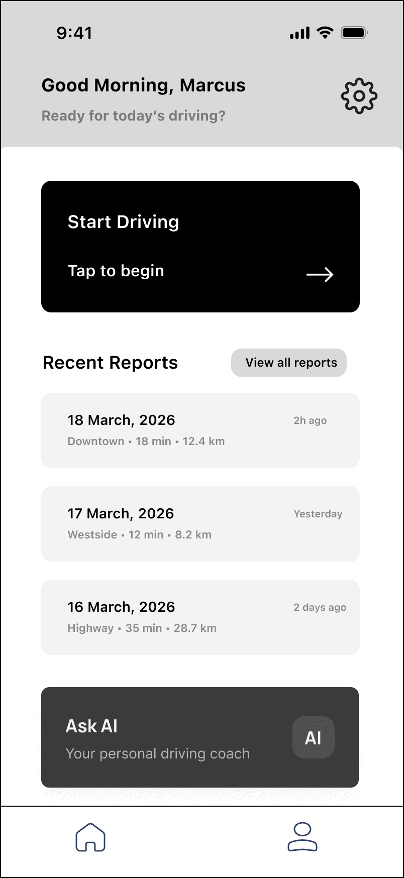
After arrival, the driver sees a safety score, two or three neutral observations, and an AI assistant that can answer questions about their driving data. It acts as a mirror, not a judge: observations replace blame, and a passive score becomes an active conversation.
Iterating through real testing
We tested both wireframes and a high-fidelity prototype on UserTesting.com, with three participants in each round. The results supported several decisions while also exposing important concerns and limits.
The insurance incentive was the clearest reason participants would keep using the product, and overall usability was sound. The personalised pre-drive prompt felt most likely to influence behaviour because it was specific—naming an exact exit and context was more meaningful than a generic “drive carefully.”
Participants also raised tensions. Some wanted a real-time AI co-driver, which we had intentionally avoided. Others found even audio distracting, reinforcing that in-drive prompts must be restrained and optional. Several people did not understand how the score was calculated or what labels such as “high-risk-area behaviour” meant, revealing a need for clearer visualisation and progressive disclosure.
Our most important change was to let the post-drive AI explain the score first.
The score initially felt like an opaque verdict: participants saw the total but not its dimensions or meaning. We let the AI explain the evidence in plain language. A driver can ask, “Why do I keep losing points on the highway?” and receive an explanation tied to specific moments from the drive. The score becomes something they can question, reinforcing the principle of a mirror, not a judge.
We made two further changes. First, the AI entry point now explains that it appears after each drive, setting expectations that it is not a live co-driver. Second, because insurance is the core motivation, a 30-day progress bar on the home screen keeps the reason for continuing visible.
Calibrating judgement, not speed
We began by treating speeding as a behaviour that needed immediate correction. Research showed something deeper: drivers continually rationalise it—“I was following traffic,” “I was only a little over,” or “this road feels safe.” The design opportunity was not simply to slow someone down, but to help them step back and see how they judge risk.
This is why faster, smarter AI is not automatically safer. Feedback delivered during the drive competes for attention; feedback that only gives orders teaches compliance or avoidance. Explaining patterns after the journey gives drivers room to reconsider their own decisions. The goal is not a more authoritative co-driver, but a more reliable driver.
I see the insurance incentive as scaffolding: it can start change, but it should not be the only reason change continues. If safer behaviour lasts only while a reward is present, the underlying judgement has not shifted. Real change begins when the external incentive recedes and a better internal decision remains.
We named the project Slow is Fast, echoing the idea that less is more. “Slow” means resisting the urge to correct instantly and making room for understanding. A successful system should gradually recede, so drivers no longer need the next warning to make a better decision. Change becomes possible when people can see how they judge risk.
