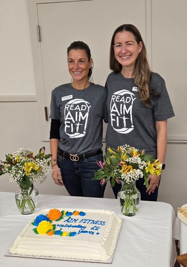
Meg & Michelle · AIM Fitness 12th anniversary
01 / 05
AIM Fitness is a Canadian fitness company that has served older adults for 12 years through in-person classes, television programs, and a subscription-based online platform launched during the pandemic. Its online community is small—about 60 members—but well established and ready to grow.
This redesign was an applied research partnership between AIM Fitness and the Sheridan Centre for Elder Research. As a research assistant, I combined three months of user research with a competitive review of 23 North American products, then translated the findings into interface concepts that lower barriers for new members without losing the platform’s strong sense of community.
Led the competitive analysis and recommendations report
Contributed to survey design and user interviews
Designed class discovery, class details, community, and member dashboard experiences
Co-authored and designed the final report and public project brochure
AIM Fitness (Activities in Motion Inc.)
Sheridan Centre for Elder Research
Retention was AIM Fitness’s central business question. For our research team, it raised a broader one: how can an online fitness platform help older adults stay active and healthy? The data revealed a clear experience gap between long-term members and newcomers.
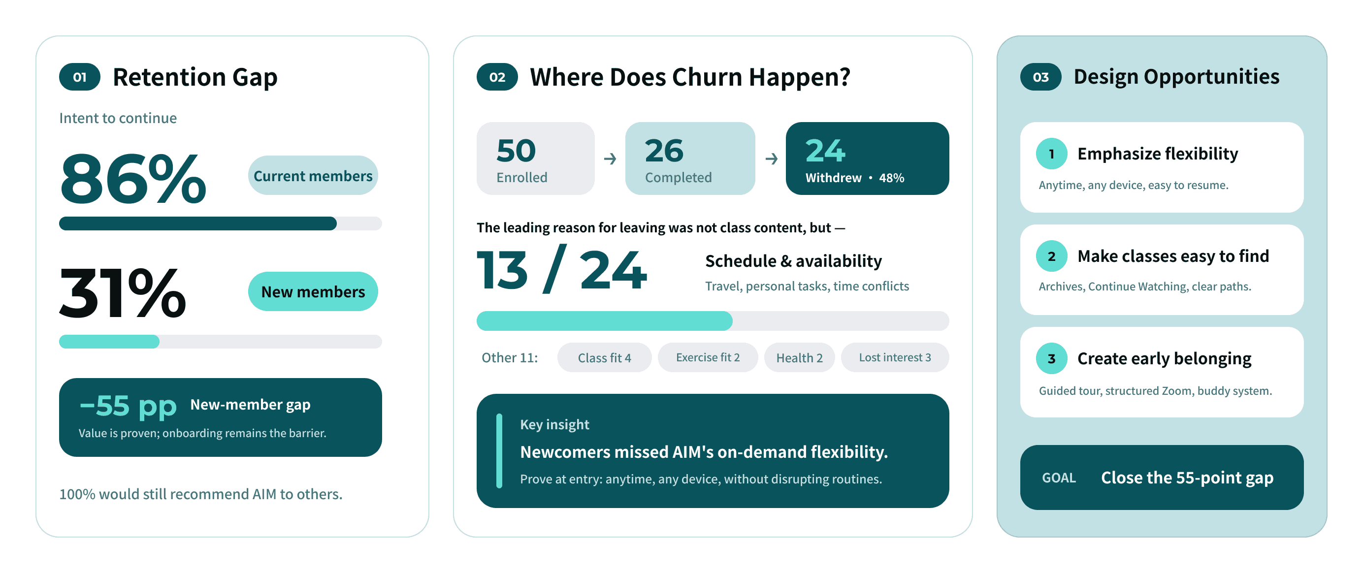
After three months, 86% of long-term members planned to renew, compared with only 31% of new members. More than half of those who left cited travel or schedule conflicts as well as usability issues. The platform’s greatest promise—flexible, on-demand exercise—was neither communicated clearly nor made easy to access.
New members faced several barriers: registration and onboarding were confusing; past classes were difficult to find; and joining the monthly group chat could feel like entering a close-knit circle as an outsider.
I reframed the problem: the platform did not need more features; it needed a clearer onboarding path. The redesign had to close the gap between new and established members by helping newcomers get oriented quickly and feel that they belonged.
Two research tracks shaped the redesign:
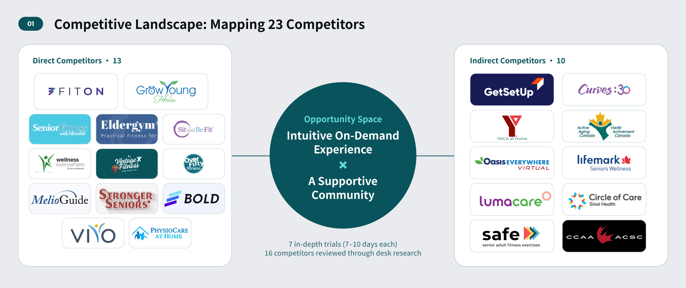
Competitive review — I independently compared 23 North American products: 13 direct and 10 indirect competitors. I tested seven for 7–10 days and turned the findings into practical recommendations.
User research — I contributed to survey design, seven biweekly surveys, pre- and post-program fitness assessments, and five in-depth interviews. Of the 50 people who enrolled, 26 completed the full three-month study.
The most valuable part was working directly with the client and seeing the research influence real decisions. Every two weeks, we reviewed the direction and proposed changes with AIM’s founder, then evaluated each decision through four lenses:
Research — Is it supported by evidence and relevant theory?
Users — What are older adults actually struggling with?
Market — Which patterns are worth borrowing, and which should we avoid?
Business fit — What could AIM realistically support given its resources, budget, and priorities?
Many competitors looked modern but overwhelmed users with information, especially older adults. We borrowed useful patterns while keeping information density under control. User complaints about finding past videos, competitor features such as Continue Watching, and the founder’s feedback all pointed to the same solution: search, breadcrumbs, and class playlists. The client received an evidence-based plan that could be prioritised and implemented incrementally.
We translated the question into three concrete needs: find a class, know what to do next, and see clearly.
Find a class. Members disliked scrolling through long archives. We added search and filters, a persistent class playlist with thumbnails and durations, breadcrumbs, and a clear way back to the full class library. The goal was to make any class reachable within two or three steps.
Start with confidence. The strongest onboarding flows used a short questionnaire and a visible roadmap. This lets the platform learn about each member while making the next step obvious, instead of dropping them into an empty dashboard. It became one of the quickest, most actionable changes we recommended.
See clearly. For older adults, accessibility is foundational. A consistent toolbar on every page lets members enlarge text or switch to high contrast. It remains visible, predictable, and dismissible instead of being buried in settings.
We also simplified progress tracking. The previous check-in table felt distracting, so we replaced it with a lightweight, passive progress view plus optional save and like actions. Members who value progress can see it; everyone else can ignore it.
The most important insight was that community—not any single feature—kept members engaged. Retirement can narrow social roles, daily routines, and social networks. A place where people are remembered, meet peers, and return regularly can become a meaningful source of support. That is also what a growing community is most at risk of losing.
Beyond the class experience, I designed the community and member dashboard. The goal was not to generate more interaction, but to help new members feel they belonged sooner:
Structure group conversations. Visible agendas, advance scheduling, and a facilitator reduce social pressure for quieter newcomers.
Make connection visible, not noisy. Community updates, highlighted Ambassadors, and a buddy system make peer support easier to find without overwhelming the experience.
Use rewards with restraint. We kept badges and streaks but avoided leaderboards. This community is built on mutual support, not competition.
Language mattered too. One member said the platform’s wording sometimes felt infantilising. We worked with the founder to define more inclusive language principles. The change may be visually subtle, but it affects whether members feel respected.
We delivered an actionable redesign report, a complete high-fidelity Figma concept built on AIM Fitness’s existing brand, and a public-facing project brochure. We also presented the research at AIM Fitness’s 12th-anniversary event, for which my partner and I created a custom logo and social media assets.
AIM Fitness already worked with a long-term web studio. Given the available budget, the studio implemented selected recommendations within the existing site instead of rebuilding the full interface. This reinforced an important lesson: for a small local business, budget and existing supplier relationships are part of the product context. The client was pleased with the work and asked us to support implementation, but the research timeline did not allow us to continue.
This project changed how I think about accessibility and design for older adults. Members noticed differences in music volume, caption size, and even small details in button design. Accessibility was not a compliance item; it was a prerequisite for participation.
It also changed how I balance research ideals with business reality. The ideal solution suggested by research or industry benchmarks may not be realistic for a small local business today. A designer’s role is to clarify the real needs, then build on the client’s existing strengths. Here, the strongest advantage was community: the same quality that retained long-term members could also help new ones feel welcome.